BFC 定义
BFC(Block formatting context)直译为”块级格式化上下文”。它是一个独立的渲染区域,只有Block-level box参与, 它规定了内部的Block-level Box如何布局,并且与这个区域外部毫不相干。
在解释什么是BFC之前,我们需要先知道Box、Formatting Context的概念。
Box:css布局的基本单位
Box 是 CSS 布局的对象和基本单位, 直观点来说,就是一个页面是由很多个 Box 组成的。元素的类型和 display 属性,决定了这个 Box 的类型。 不同类型的 Box, 会参与不同的 Formatting Context(一个决定如何渲染文档的容器),因此Box内的元素会以不同的方式渲染。让我们看看有哪些盒子:
- block-level box:display 属性为 block, list-item, table 的元素,会生成 block-level box。并且参与 block fomatting context;
- inline-level box:display 属性为 inline, inline-block, inline-table 的元素,会生成 inline-level box。并且参与 inline formatting context;
- run-in box: css3 中才有, 这儿先不讲了。
Formatting Context
Formatting context 是 W3C CSS2.1 规范中的一个概念。它是页面中的一块渲染区域,并且有一套渲染规则,它决定了其子元素将如何定位,以及和其他元素的关系和相互作用。最常见的 Formatting context 有 Block fomatting context (简称BFC)和 Inline formatting context (简称IFC)。
BFC是一个独立的布局环境,其中的元素布局是不受外界的影响,并且在一个BFC中,块盒与行盒(行盒由一行中所有的内联元素所组成)都会垂直的沿着其父元素的边框排列。
BFC的布局规则
- 内部的Box会在垂直方向,一个接一个地放置。
- Box垂直方向的距离由margin决定。属于同一个BFC的两个相邻Box的margin会发生重叠。
- 每个盒子(块盒与行盒)的margin box的左边,与包含块border box的左边相接触(对于从左往右的格式化,否则相反)。即使存在浮动也是如此。
- BFC的区域不会与float box重叠。
- BFC就是页面上的一个隔离的独立容器,容器里面的子元素不会影响到外面的元素。反之也如此。
- 计算BFC的高度时,浮动元素也参与计算。
如何创建BFC
- 1、float的值不是none。
- 2、position的值不是static或者relative。
- 3、display的值是inline-block、table-cell、flex、table-caption或者inline-flex
- 4、overflow的值不是visible
BFC的作用
1.利用BFC避免margin重叠。
一起来看一个例子:
1
2
3
4
5
6
7
8
9
10
11
12
13
14
15
16
17
18
19
20
21
22
23
24
25
26
27
| <!DOCTYPE html>
<html lang="en">
<head>
<meta charset="UTF-8">
<meta name="viewport" content="width=device-width, initial-scale=1.0">
<meta http-equiv="X-UA-Compatible" content="ie=edge">
<title>防止margin重叠</title>
</head>
<style>
*{
margin: 0;
padding: 0;
}
p {
color: #f55;
background: yellow;
width: 200px;
line-height: 100px;
text-align:center;
margin: 30px;
}
</style>
<body>
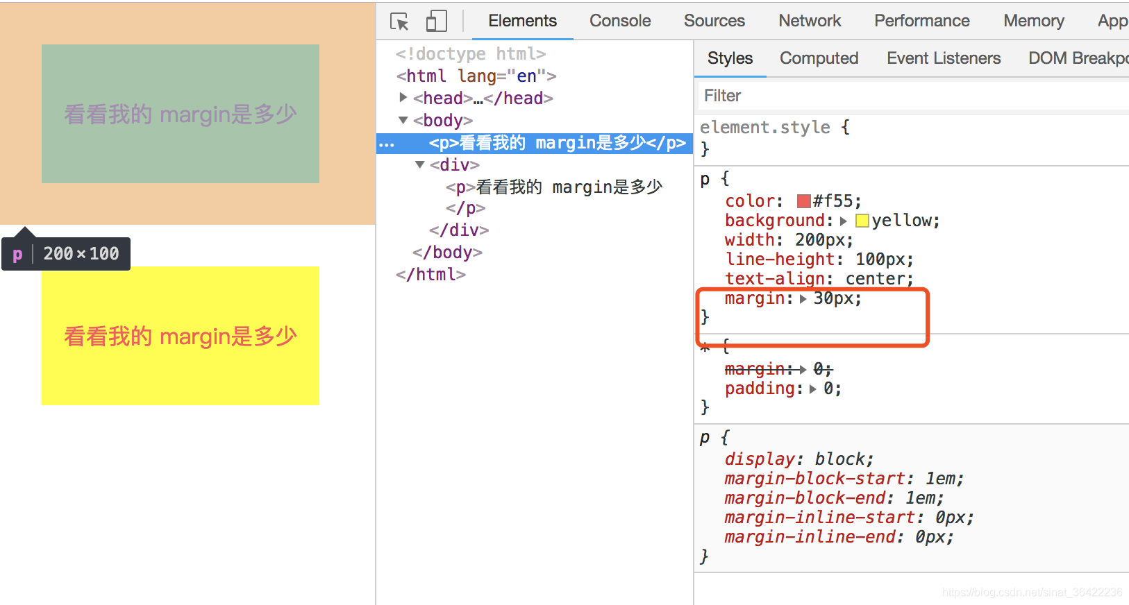
<p>看看我的 margin是多少</p>
<p>看看我的 margin是多少</p>
</body>
</html>
|
页面生成的效果就是这样的:
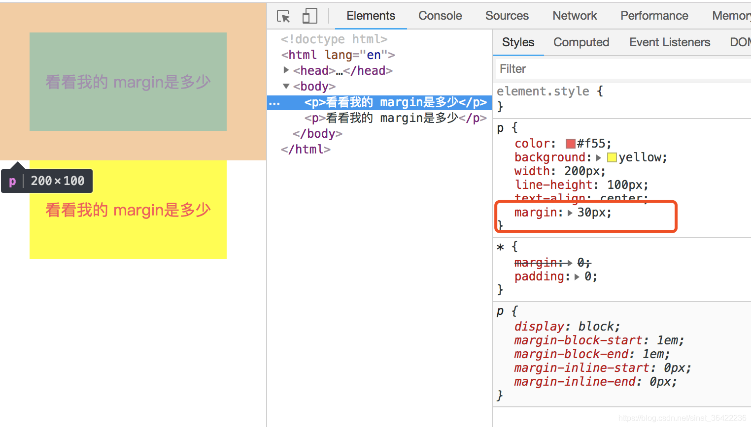
根据第二条,属于同一个BFC的两个相邻的Box会发生margin重叠,所以我们可以设置,两个不同的BFC,也就是我们可以让把第二个p用div包起来,然后激活它使其成为一个BFC
1
2
3
4
5
6
7
8
9
10
11
12
13
14
15
16
17
18
19
20
21
22
23
24
25
26
27
28
29
30
31
32
| <!DOCTYPE html>
<html lang="en">
<head>
<meta charset="UTF-8">
<meta name="viewport" content="width=device-width, initial-scale=1.0">
<meta http-equiv="X-UA-Compatible" content="ie=edge">
<title>防止margin重叠</title>
</head>
<style>
*{
margin: 0;
padding: 0;
}
p {
color: #f55;
background: yellow;
width: 200px;
line-height: 100px;
text-align:center;
margin: 30px;
}
div{
overflow: hidden;
}
</style>
<body>
<p>看看我的 margin是多少</p>
<div>
<p>看看我的 margin是多少</p>
</div>
</body>
</html>
|
2.自适应两栏布局
根据:
- 每个盒子的margin box的左边,与包含块border box的左边相接触(对于从左往右的格式化,否则相反)。即使存在浮动也是如此。
1
2
3
4
5
6
7
8
9
10
11
12
13
14
15
16
17
18
19
20
21
22
23
24
25
26
27
28
29
30
31
32
33
34
35
36
37
38
39
40
41
| <!DOCTYPE html>
<html lang="en">
<head>
<meta charset="UTF-8">
<meta name="viewport" content="width=device-width, initial-scale=1.0">
<meta http-equiv="X-UA-Compatible" content="ie=edge">
<title>Document</title>
</head>
<style>
*{
margin: 0;
padding: 0;
}
body {
width: 100%;
position: relative;
}
.left {
width: 100px;
height: 150px;
float: left;
background: rgb(139, 214, 78);
text-align: center;
line-height: 150px;
font-size: 20px;
}
.right {
height: 300px;
background: rgb(170, 54, 236);
text-align: center;
line-height: 300px;
font-size: 40px;
}
</style>
<body>
<div class="left">LEFT</div>
<div class="right">RIGHT</div>
</body>
</html>
|
页面:
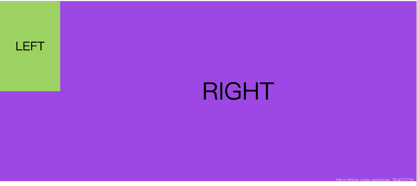
又因为:
所以我们让right单独成为一个BFC
1
2
3
4
5
6
7
8
9
10
11
12
13
14
15
16
17
18
19
20
21
22
23
24
25
26
27
28
29
30
31
32
33
34
35
36
37
38
39
40
41
42
| <!DOCTYPE html>
<html lang="en">
<head>
<meta charset="UTF-8">
<meta name="viewport" content="width=device-width, initial-scale=1.0">
<meta http-equiv="X-UA-Compatible" content="ie=edge">
<title>Document</title>
</head>
<style>
*{
margin: 0;
padding: 0;
}
body {
width: 100%;
position: relative;
}
.left {
width: 100px;
height: 150px;
float: left;
background: rgb(139, 214, 78);
text-align: center;
line-height: 150px;
font-size: 20px;
}
.right {
overflow: hidden;
height: 300px;
background: rgb(170, 54, 236);
text-align: center;
line-height: 300px;
font-size: 40px;
}
</style>
<body>
<div class="left">LEFT</div>
<div class="right">RIGHT</div>
</body>
</html>
|
页面:
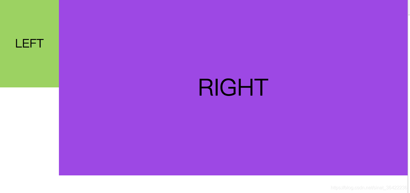
right会自动的适应宽度,这时候就形成了一个两栏自适应的布局。
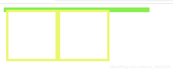
3.清楚浮动。
当我们不给父节点设置高度,子节点设置浮动的时候,会发生高度塌陷,这个时候我们就要清楚浮动。
比如这样:
1
2
3
4
5
6
7
8
9
10
11
12
13
14
15
16
17
18
19
20
21
22
23
24
25
26
27
28
| <!DOCTYPE html>
<html lang="en">
<head>
<meta charset="UTF-8">
<meta name="viewport" content="width=device-width, initial-scale=1.0">
<meta http-equiv="X-UA-Compatible" content="ie=edge">
<title>清除浮动</title>
</head>
<style>
.par {
border: 5px solid rgb(91, 243, 30);
width: 300px;
}
.child {
border: 5px solid rgb(233, 250, 84);
width:100px;
height: 100px;
float: left;
}
</style>
<body>
<div class="par">
<div class="child"></div>
<div class="child"></div>
</div>
</body>
</html>
|
页面:
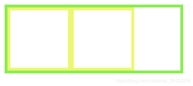
这个时候我们根据最后一条:
给父节点激活BFC
1
2
3
4
5
6
7
8
9
10
11
12
13
14
15
16
17
18
19
20
21
22
23
24
25
26
27
28
29
| <!DOCTYPE html>
<html lang="en">
<head>
<meta charset="UTF-8">
<meta name="viewport" content="width=device-width, initial-scale=1.0">
<meta http-equiv="X-UA-Compatible" content="ie=edge">
<title>清除浮动</title>
</head>
<style>
.par {
border: 5px solid rgb(91, 243, 30);
width: 300px;
overflow: hidden;
}
.child {
border: 5px solid rgb(233, 250, 84);
width:100px;
height: 100px;
float: left;
}
</style>
<body>
<div class="par">
<div class="child"></div>
<div class="child"></div>
</div>
</body>
</html>
|
页面:
总结
以上例子都体现了:
BFC就是页面上的一个隔离的独立容器,容器里面的子元素不会影响到外面的元素。反之也如此。
因为BFC内部的元素和外部的元素绝对不会互相影响,因此, 当BFC外部存在浮动时,它不应该影响BFC内部Box的布局,BFC会通过变窄,而不与浮动有重叠。同样的,当BFC内部有浮动时,为了不影响外部元素的布局,BFC计算高度时会包括浮动的高度。避免margin重叠也是这样的一个道理。
本文转自 https://blog.csdn.net/sinat_36422236/article/details/88763187,如有侵权,请联系删除。